User Research
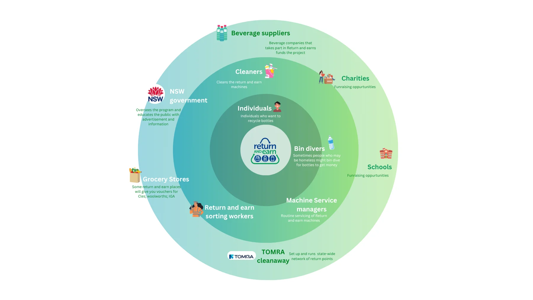
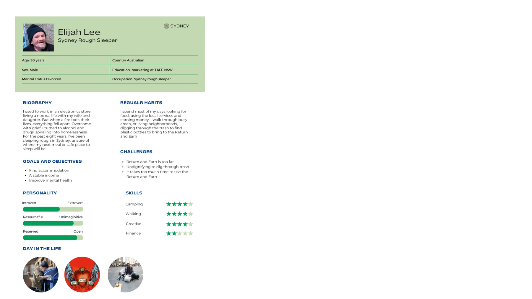
Stakeholder and persona mapping was performed to determine the user profile for the revamp project, ensuring redesigned features catered to the needs of the target user.

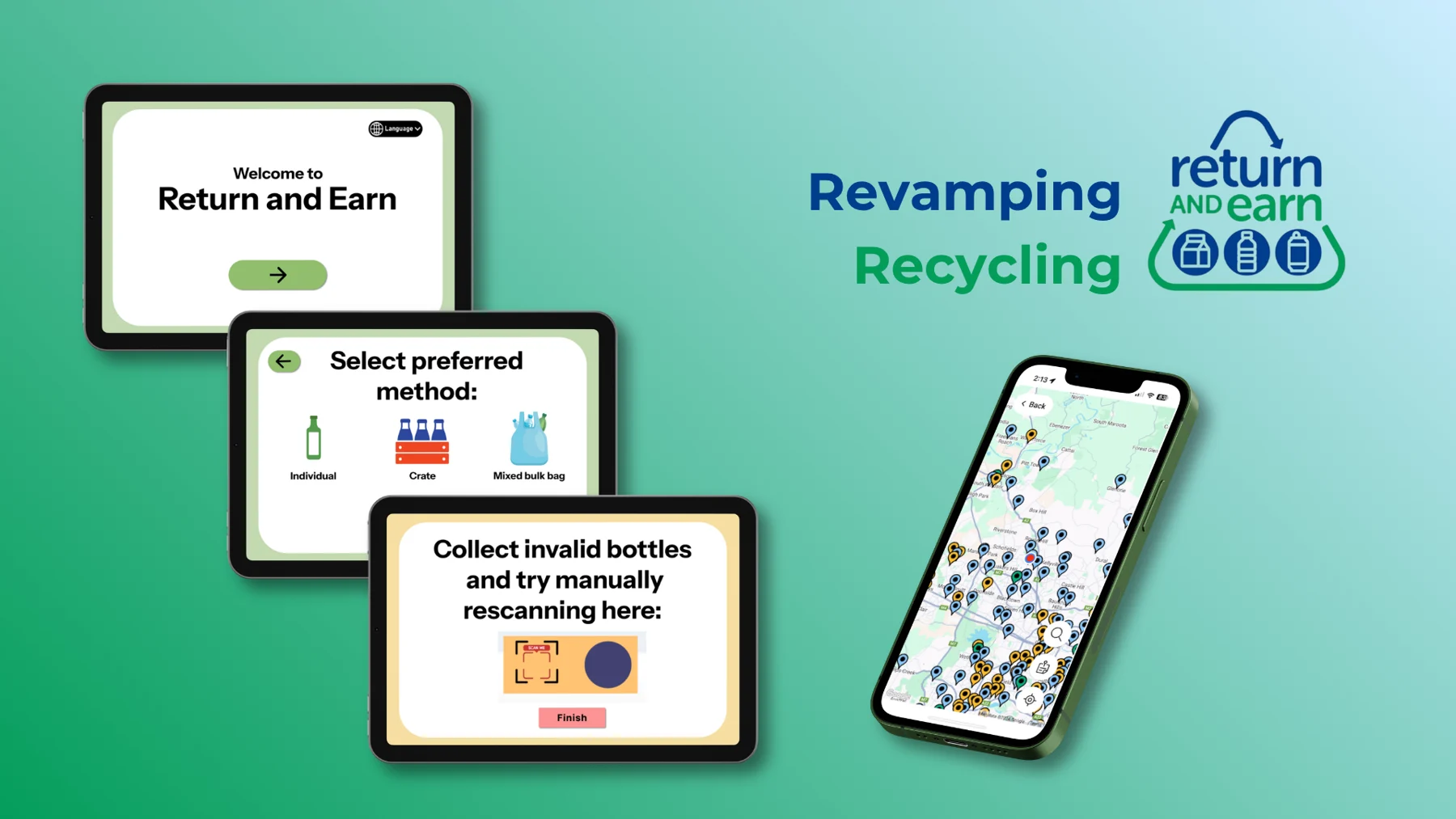
Redesigned the NSW Government's Return and Earn digital experience to simplify recycling processes, enhance accessible features, and incentivise sustainable practices.
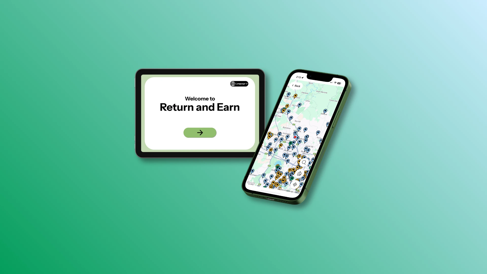
The existing Return and Earn experience is inefficient and time-consuming, with machines often making errors, only allowing single-bottle deposits, having unclear support features, and inaccessible digital interfaces, making recycling less convenient and rewarding for users and discouraging ongoing use of the system.
Limited user support found, as neither the app nor booth interface provides clear help pathways when bottles are rejected, machines jam, or technical issues occur
Poor site visibility, as users lack real-time information about machine status, hazards, closures or technical problems before arriving
Booth interface currently features limited language options, has poor visual accessibility as buttons are too small, and unisensory design
Time-consuming deposit process, as feeding bottles individually makes recycling slow and discourages repeat use; a bulk-drop chute could improve efficiency but would require corresponding updates across the digital experience
Stakeholder and persona mapping was performed to determine the user profile for the revamp project, ensuring redesigned features catered to the needs of the target user.
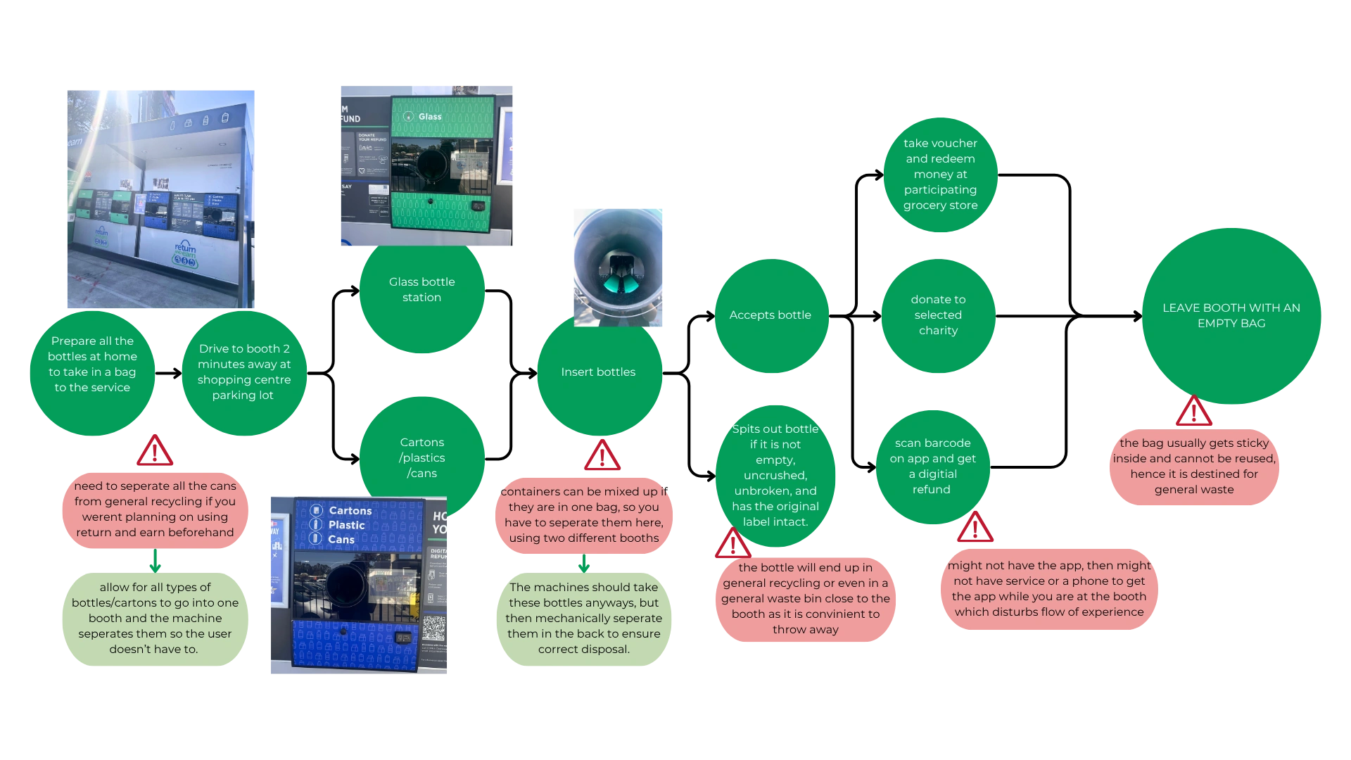
Return and Earn Booth process was tested and an observation flow diagram created to identify pain points, validating user survey responses.
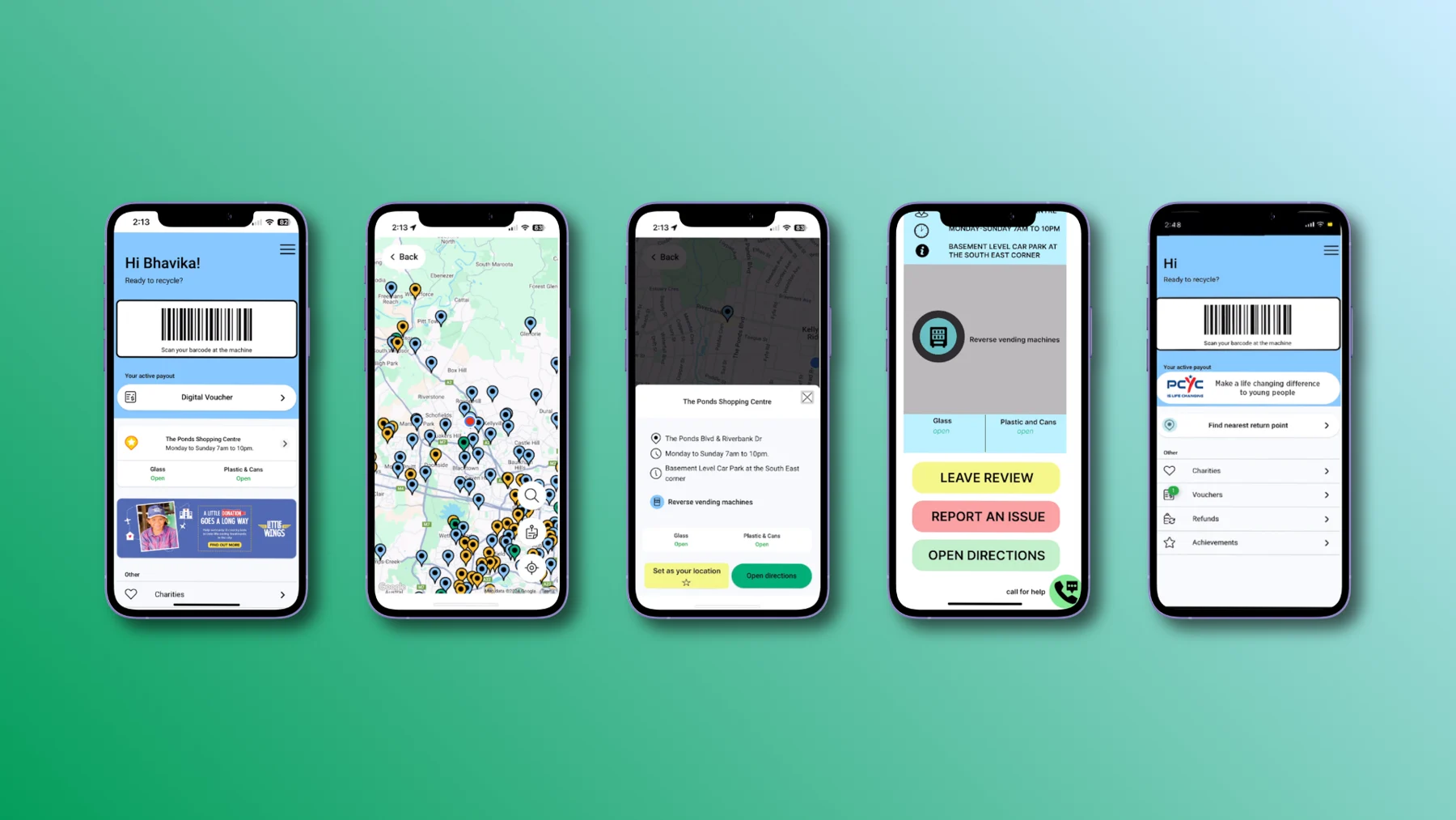
Map functionality was added to the mobile app to indicate which booths are operating, and allowed users to leave reviews and feedback for locations.
Physical booth redesigned to allow bulk-bottle deposits, manual scanning for rejected bottles added, and accessibility features such as language toggle, audio function, and universal icons added.